PSD to HTML / PSD to WordPress Theme
Professional conversion service from Photoshop (PSD), Figma, Sketch, XD, and other design applications to production-ready responsive HTML with pixel-perfect quality.
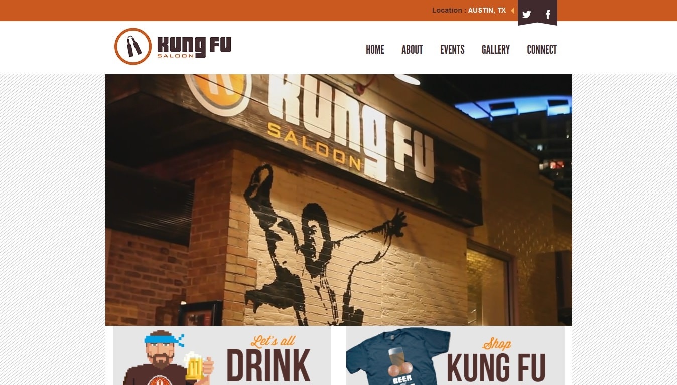
Screenshots
About the Project
This design-to-code conversion service has helped dozens of clients bring their design visions to life as functional, responsive, and high-performance websites. With over a decade of experience in web development, every conversion is executed to the highest professional standards to ensure final results that are not only visually stunning, but also technically solid.
The conversion process follows a systematic and structured approach, starting from in-depth analysis of design files, selecting the right technologies, to implementing clean and documented code. Each project is treated uniquely by considering specific needs, target audiences, and client business goals, so the final result not only meets visual expectations, but also provides added value in terms of user experience and technical performance.
Key Features
- Pixel Perfect Conversion — High-accuracy design implementation down to the smallest detail, ensuring visual consistency between mockup and final result across various screen resolutions.
- High-Quality Code — Writing clean, structured code following industry best practices to facilitate future maintenance and development.
- Maximum Performance Optimization — Implementation of advanced optimization techniques including lazy loading, code splitting, and asset compression to ensure fast loading times and smooth user experience.
- Comprehensive Documentation — Each project comes with clear technical documentation to help other development teams understand code structure and perform customization.
- Modern and Latest Technologies — Use of the latest frameworks and libraries such as Tailwind CSS, Bootstrap, SASS/SCSS, and JavaScript ES6+ for results that are not only modern but also future-proof.
- Responsive and Mobile-First — Implementation of mobile-first approach strategy to ensure optimal display on all screen sizes, from smartphones to desktops.
- Cross-Browser Compatibility — Comprehensive testing on various modern browsers to ensure display and functionality consistency.
- Semantic HTML — Use of semantic HTML structure to improve accessibility, SEO, and code maintainability.
Challenges & Solutions
-
Challenge: Highly complex designs often have visual elements that are difficult to translate into code without sacrificing performance. Micro-animations, smooth transitions, and advanced visual effects require special approaches to avoid slowing loading time. Solution: Implementation of progressive enhancement strategy leveraging efficient CSS animations, combination of optimized CSS transforms and JavaScript, and use of requestAnimationFrame for smooth animations. For specific cases, lightweight libraries like GSAP or Web Animations API-based animations with superior performance compared to conventional methods are used.
-
Challenge: Design files from various sources like PSD, Figma, or XD often have inconsistencies in spacing, typography, or color values that can hinder the development process. Solution: Conduct thorough design audit at project start to identify inconsistencies, create mini design system by defining consistent design tokens (colors, typography, spacing), and communicate findings to designers or clients for clarification before starting coding. This approach not only speeds up development process but also produces more maintainable code.
-
Challenge: The need to support older browsers while still using modern technology creates complex technical dilemmas. Solution: Implementation of progressive enhancement strategy with core functionality that works on all browsers, plus enhancements for modern browsers. Use of PostCSS with autoprefixer to automatically handle vendor prefixes, and conditional polyfills that load only when needed to maintain optimal performance on modern browsers.
-
Challenge: Image assets from designers are often not optimized and large in size, significantly impacting loading time. Solution: Implementation of comprehensive asset optimization workflow including conversion to modern formats like WebP with JPEG/PNG fallback, responsive images with srcset and sizes attributes, lazy loading for images below the fold, and use of modern image formats with proper art direction. Result: asset size reduction of up to 70% without significant visual quality loss.